Colour Theory for Landscape Photography
- grey1217
- Nov 20, 2020
- 5 min read
Updated: Sep 13, 2021
Sick of those oversaturated unnatural photos? Let’s be frank about this. A saturated photo does give viewers a more impactful impression, but if you overdo it, it can easily causing visual fatigue. Those are not the kind of photos you would want to hang it in your living room. But no worry, I’m going to share with you on how to produce a colourful photo while keeping a natural look. Let’s start with understanding the Colour Wheel first.

A Colour wheel is the basis of colour theory; it shows the relationship between colours. Each Colour Wheel here represents one Colour Harmony. A Colour Harmony is a guideline on how to choose colour combinations that work. There are a total six of them, but based on my experiences, the most commonly used colour harmony are Complementary, Analogous and Triadic. There’s another one more called Monochromatic, which means using only a single colour.
Complementary Colour Harmony
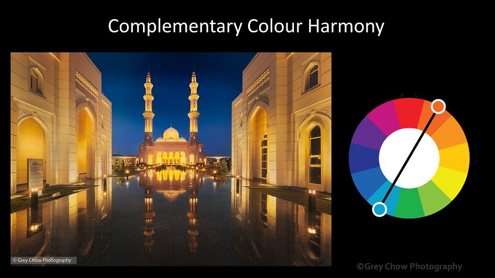
This is one of the most commonly used Colour Harmony, and I believe you may have already seen some example before. If not, try searching Google for the keywords “blue and yellow movie poster”. You will see tons of samples there. For photography, blue and yellow colour combination is often seen on the cityscape, and it is the easiest to capture. Even during cloudy weather without a decent sunrise/sunset, you may still be able to capture a nice blue hour shot.
Blue hour is the period before sunrise and after sunset. During the blue hour, the sky turns blue, and then dark blue before it goes fully dark. At the same time, the artificial lights will light up the city with yellow/orange colour. (There is other light’s colour but the majority is still yellow/orange, for now.)
At the same time, the artificial lights will light up the city with yellow/orange colour.
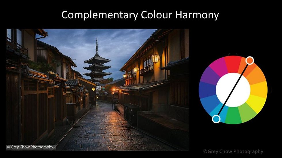
The contradict colours between the blue and yellow create a strong contrast to the visual, hence produce an impactful photo.
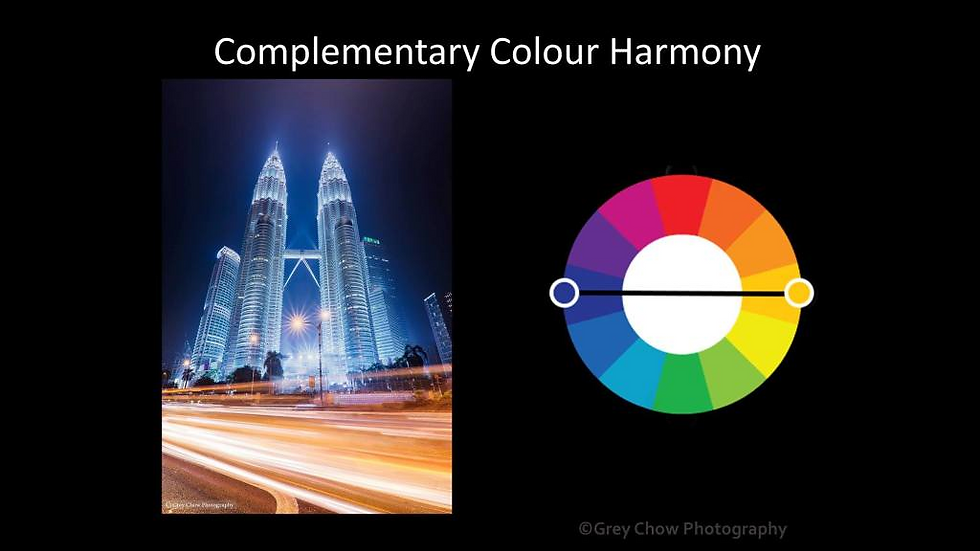
For the photo of Petronas Twin Towers, I took after the blue hour, but I tweaked the colour balance for a colder look so that I can have the “Blue and Yellow” colour combination. Then I include the yellow light trails to have more yellow colours in the foreground. This also makes the photo more interesting.
Analogous Colour Harmony
Unlike Complementary Colour Harmony that having two colours that are contradicting to each other, Analogous Colour Harmony is choosing colours that are next to each other on the colour wheel. This is often found in nature and is harmonious and pleasing to the eye. Analogous Colour Harmony can consist of more than two colours. Here are some examples.
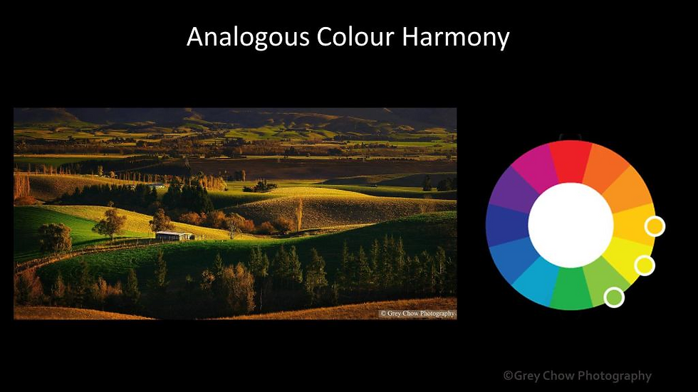
The photo of the rolling hill in New Zealand consists of orange, yellow and green. I took this photo before the sunset when the sun is low, and the light is soft. The sunlight partially illuminates the hills, adding a yellow tone to the scene.
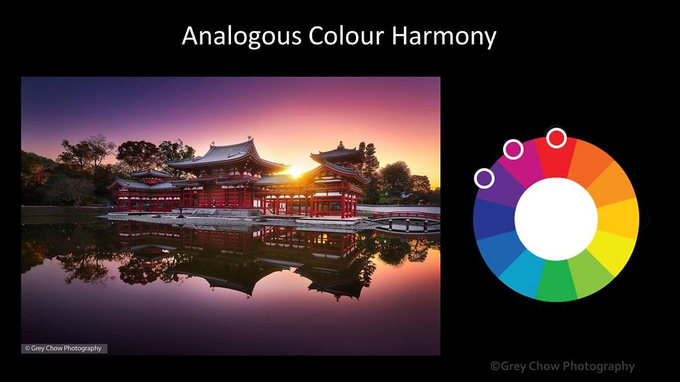
Another photo is the photo of Byodoin Temple in Japan. The temple itself is red, and the sky is full of pink and magenta colour. The pink/magenta colour sky usually appear when the weather is clear, and the sun is close to the horizon.
Triadic Colour Harmony
Triadic Colour Harmony is using three colours that are evenly spaced around the colour wheel. This colour combination tends to produce a more vibrant and vivacious result.
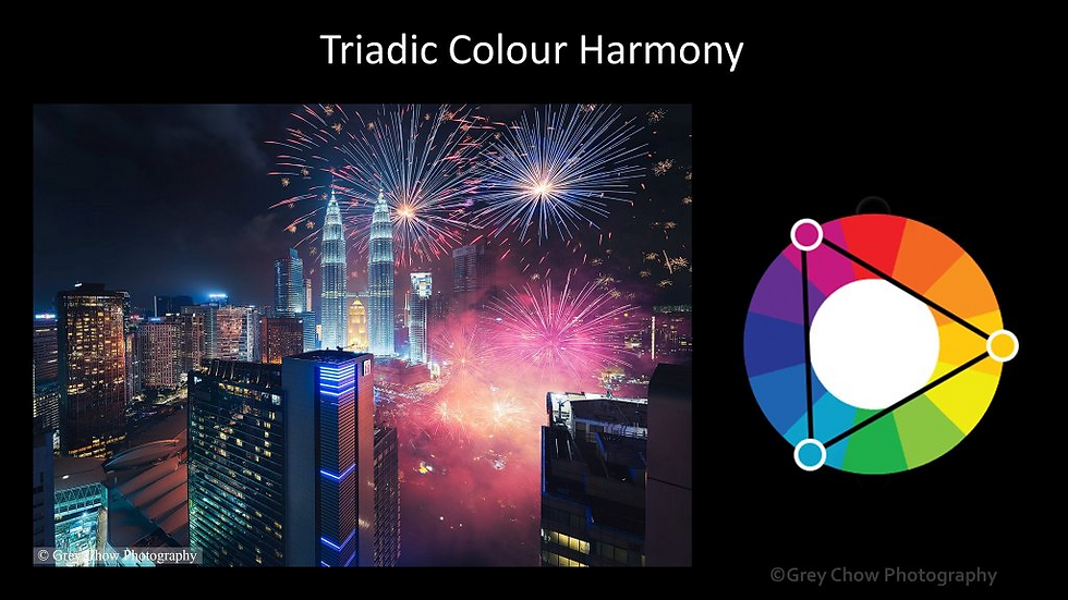
The photo of the iconic Petronas Twin Towers with fireworks in Malaysia consists of multiple colours. The three main colours here are Pink, Yellow and Blue.
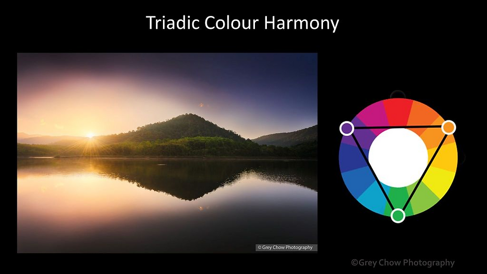
Another photo is a photo of the sunrise in Tasik Beris, Kedah. The photo consists of yellow colour from the sun, magenta colour from the sky, and green colour from the forest.
Monochromatic Colour Harmony
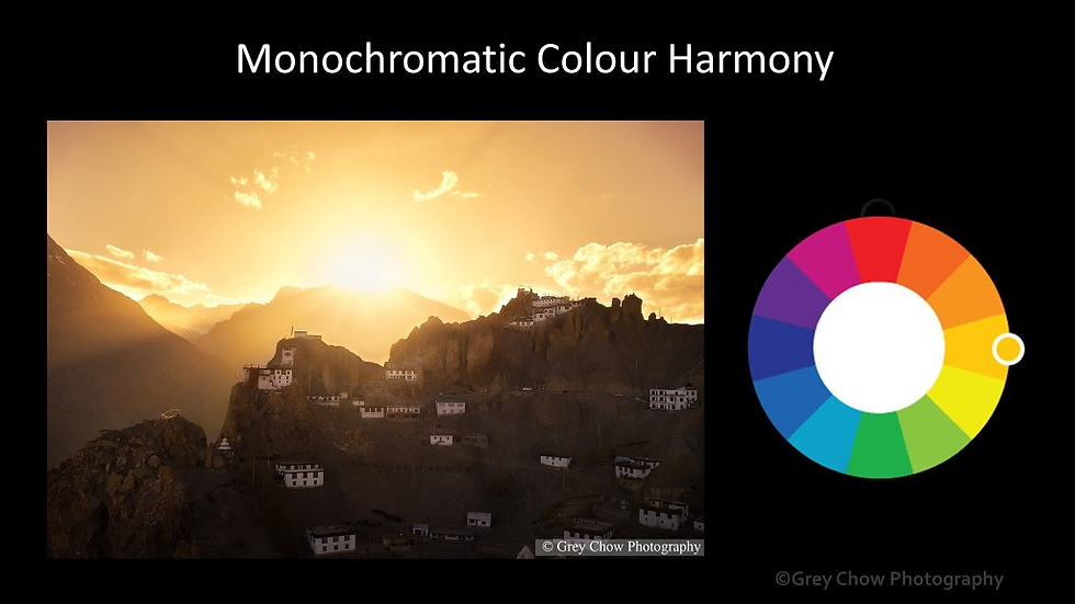
This consists only one colour but using a different degree of brightness and saturation to create variations.
One of the common ways of using this colour scheme is to add more warmth colour to a sunset photo. It helps to enhance the mood and also intensify the colour of the sunlight.
Another example is going for a colder tone. Here is a long exposure photo of the Seri Wawasan Bridge in Putrajaya.

Next, I will talk about how to make adjustments to the colours on photoshop. 🙂
Hue, Saturation & Lightness/Brightness
On Photoshop or any software editing software, there are three types of adjustments you can make to a single colour which is Hue, Saturation and Brightness. Hue is basically the actual colour, changing it will change the colour, e.g. switching from blue to red. Brightness refers to how much white (or black) is mixed in colour. Saturation is the intensity of the colour from grey (no saturation) to vivid colour. Usually, what I would do is to decide what is the primary colour. You can have two primary colours, but if you pick more than two colours, it would be very hard to get a balance between the colours. Once you decided which is your primary colour, you can focus more on boosting the saturation of that colour. For other non-primary colours, you can desaturate or darken them.
Here’s an example.
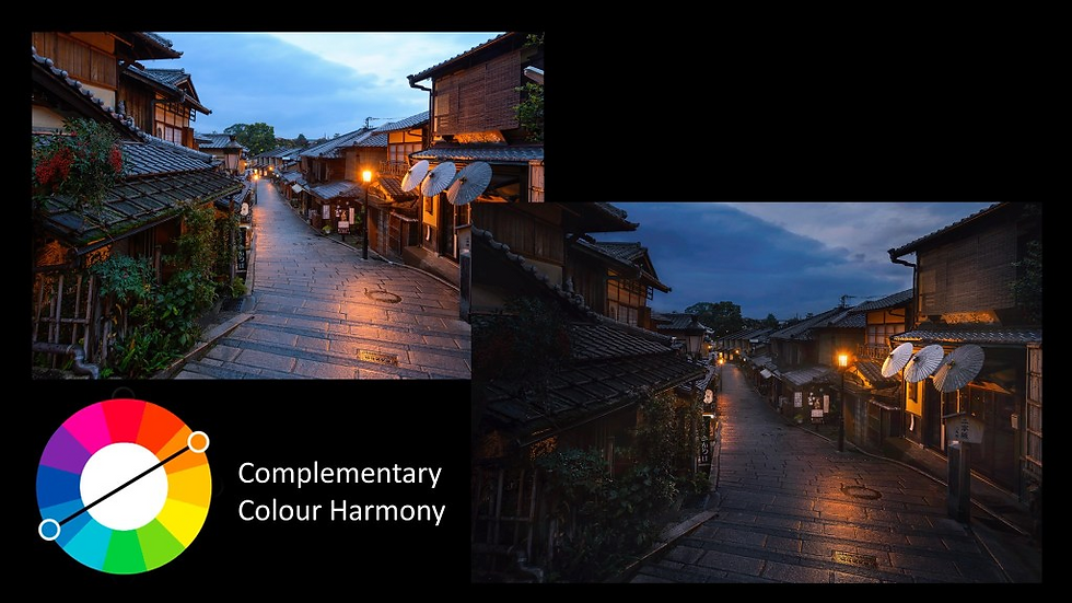
I took this photo at Ninenzaka Street in Kyoto, Japan. The photo originally consists of orange, blue, red and green. I wanted to have a cleaner look and decided to focus on only orange and blue colour. The orange and blue combination is Complementary Colour Harmony. So, I selected both green and red colour, desaturated and darkened them. At the same time, I darken the overall scene, which also indirectly saturated the blue colour. I also removed any blue colour cast on the foreground, so that I have orange colour tone at the bottom of the frame and the blue colour tone at the top.
Here’s another example that I want to share with you.
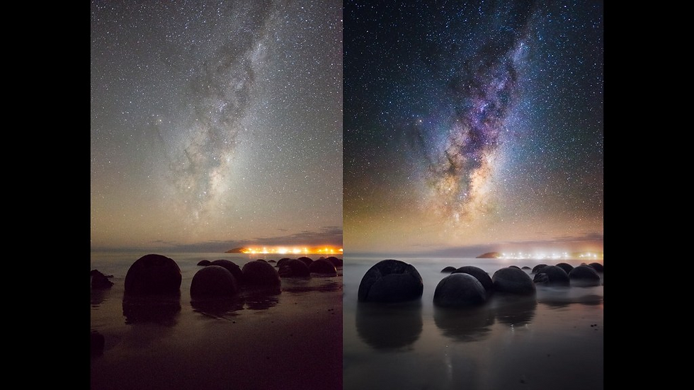
After I processed the photo, you can see blue and yellow are the primary colour of the sky with the Milky Way. Since I already have a saturated sky, I would like to keep the foreground less saturated. This is to have a distinct colour separation between the sky and the foreground. I have also brightened up the foreground to reveal more detail on the boulders. That’s all for this post. I hope you all enjoy it. 🙂

Join our Photography Masterclass Community & improve your photography skill.
Subscribe to receive photography tips & tricks and update from Grey Chow
Please feel free to share this post if you enjoy reading it! :)
.png)
Comments